6. Widgets
Widgets are available for setting the :
-
headers and footers ;
-
title pages
There are four types of widgets
-
Widgets Text and Image which always reference static elements, for example, an image from a workspace, or a text entry.
-
Classic widgets reserved for specific elements of the XML document. They are named after these elements (Title, Date, Author, etc.).
![[Tip]](cco-tip.svg)
The Organization widget corresponds to the Docbook
affiliationelement, which is part of theauthorelement. These elements are present by default in theinformationblock when a book or article is created.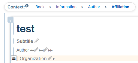
These elements can be added to the
informationblock via the menu → in the xml content editor. -
Widgets Custom Xpath allow to retrieve other elements from the XML document.
-
Widget Grid lets you group any type of widgets for adaptive placement.
Each widget can be edited directly from the settings panel. In this case, the widget can be reused as a template with predefined formatting. This type of editing is recommended for Text and Image widgets where the content can be modified for each reuse.
6.1. Editing modes
There are two editing modes for widgets:
-
from the parameter editor to the left of the preview area;
-
from the panel “Widget List” to the right of the preview area.
Editing from the Parameter Editor
Each widget can be edited directly from the parameter editor to the left of the preview area. In this case, the widget can be reused as a template with predefined formatting. This type of editing is recommended for Text and Image widgets where the content can be modified for each reuse.
Procedure 47. To set up a classic widget:
-
Click on
 to the right of the widget name.
A window opens with the settings.
-
Click on one of the colored parts of the margins and borders diagram to display its characteristics:
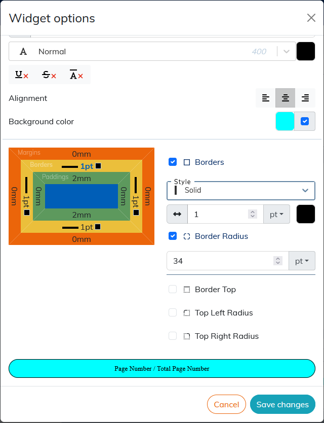
The result of the setting is displayed in the preview area at the bottom of the window.
To apply the rounded corners to the widget borders, click the border (yellow box on the diagram), select the corner or corners you want to round, and apply the desired radius value.
![[Note]](cco-note.svg) |
|
|
The sections Custom Xpath widget and Grid widget describe the specific settings for the custom Xpath widget and the Grid widget respectively. |
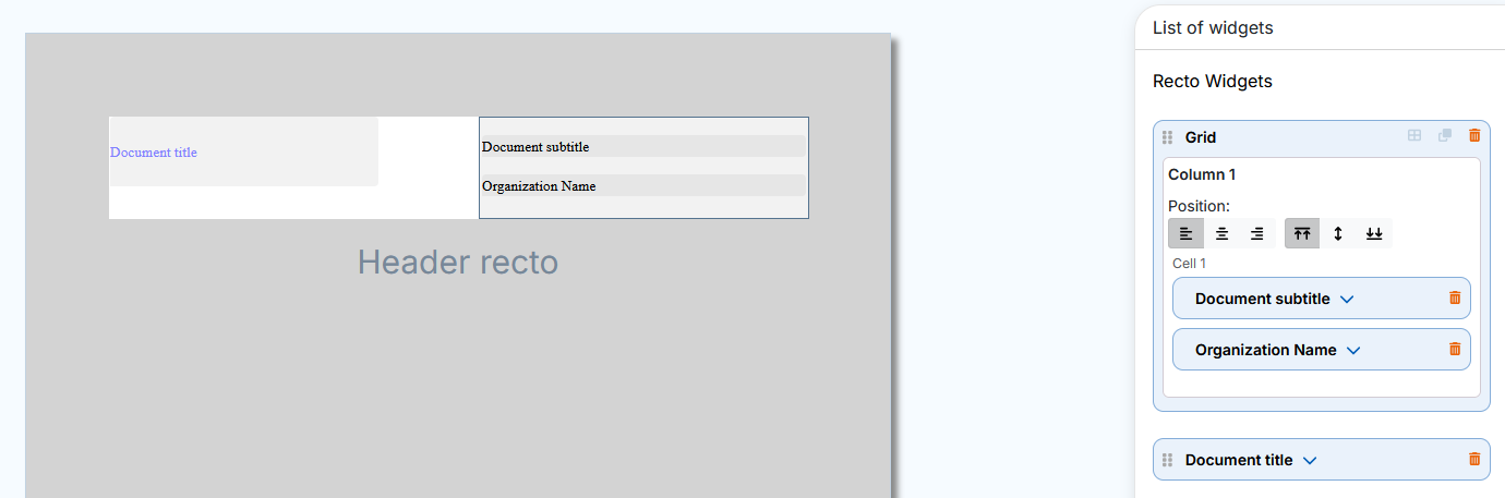
Editing from the Widget List panel
The panel “Widget List” allows you to edit the widgets dropped on the preview area (cover page or header/footer area).
Dropped widgets display their title and light gray background by default. The Grid widget displays the background and its borders.
The  button in the menu or
  button in the menu allows you to view the set widgets without their default background or borders for the Grid widget.
Each dropped widget displays a dedicated insert in the panel on the right. This insert unfolds automatically either:
-
when dropping a widget or;
-
when selecting a dropped widget.
To select a widget, click either:
-
on the dropped widget or;
-
on his insert in the panel on the right.
The selected widget and its insert are displayed with a blue border:
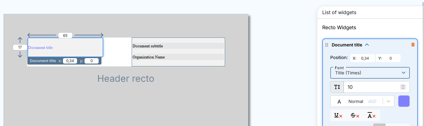
The selected widget displays the following settings available for editing in the preview area:
-
Height and width (except the Grid widget),
-
position with XY coordinates (also available in the widget insert).
The setting of styles, alignment, margins, borders etc. is done in the inset of each widget on the panel on the right.
Actions that are specific or common to all widgets are available to the left and right of the widget title in the insert:
-
 indicates the widgets that can change the order in the list (see Procedure 48, “To move the widget”);
-
 click to select and insert an image in the Image widget.
-
 click to open or close a widget insert.
-
 click to delete the widget and its insert.
|
|
|
For specific settings and actions for the Grid widget, please see Grid widget. |
It is possible to move the widgets to the panel on the right to change their order in the list.
Procedure 48. To move the widget
-
For more visibility, close the opened inserts.
-
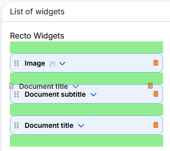
Click in the insert, hold and drag and drop the widget into one of the green areas that appear before and after the inserts:
In the case of setting a title page, setting the order of the widgets in the list on the right allows you to organize overlapping widgets.
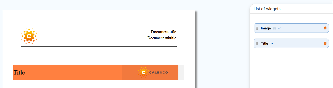
Example 3. Widget overlay on the title page
The Image widget was dropped first. The Title widget has been dropped second, so it hides the Image widget that should appear on top of the title.

Simply move the Image widget before the Title widget in the panel on the right and the image will overlay the title.
|
|
|
To edit an overlay widget that is not available for selection in the preview area, click its insert in the panel on the right. The widget is displayed on top of the others for better visibility of the change results. |
|
|
|
The change in order of widgets within a grid (within the same cell, between cells and columns) is done directly in the dropped widget. The order of widgets changes automatically in the panel on the right. |
|
|
|
For recto verso mode, the panel “Widget List” in the menu contains the widgets into two respective sections: verso widgets and recto widgets. |